Background
SwiftSync, a team collaboration app, faced challenges with user frustration due to a cluttered and unintuitive profile settings screen. Users struggled to update personal information and manage preferences, leading to incomplete profiles and decreased satisfaction.
Core problem
The outdated profile settings screen lacked organization, making navigation cumbersome. Key actions like managing notifications, privacy, and account information were buried, leading to user disengagement.
The Approach for SwiftSync
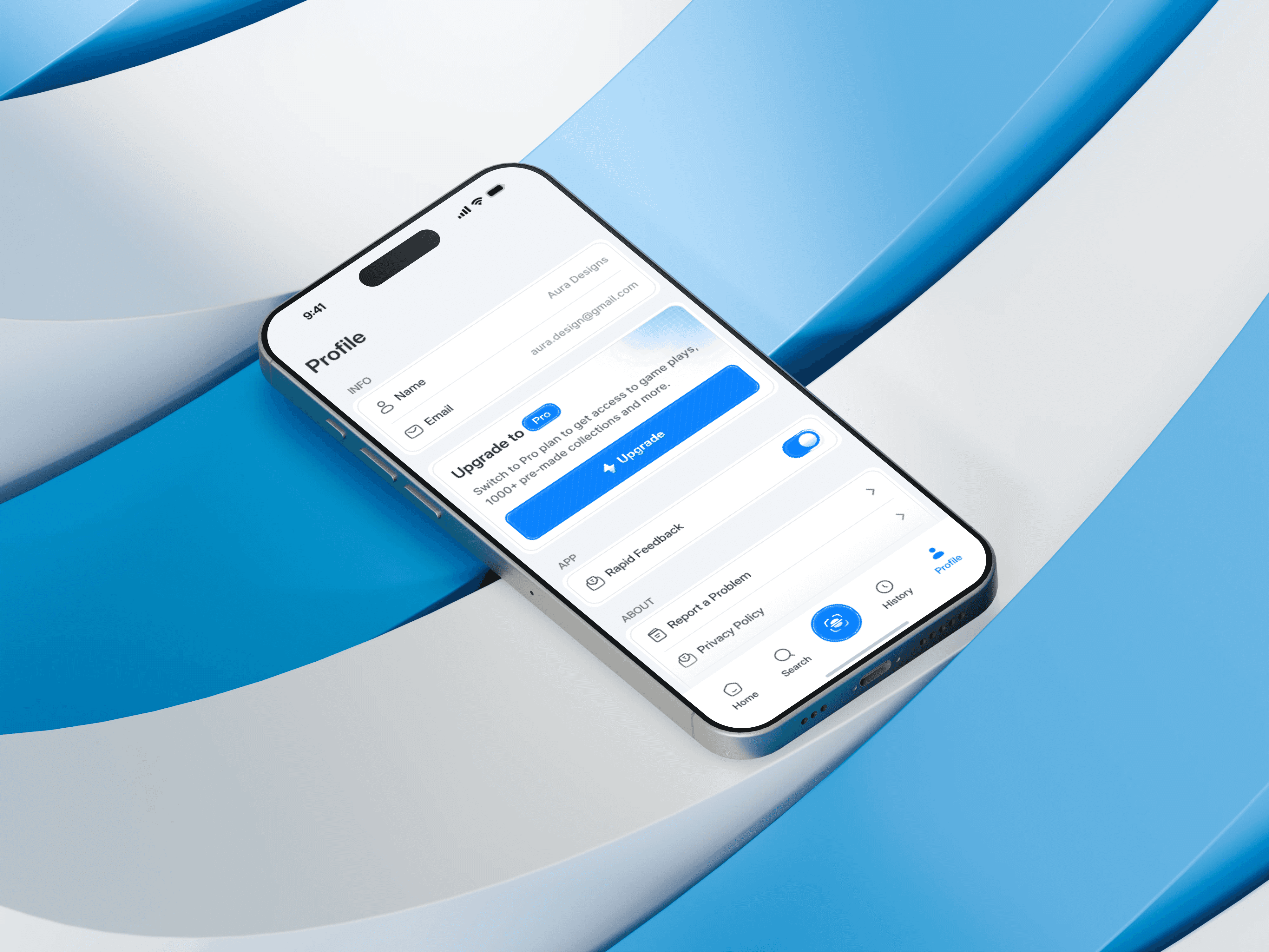
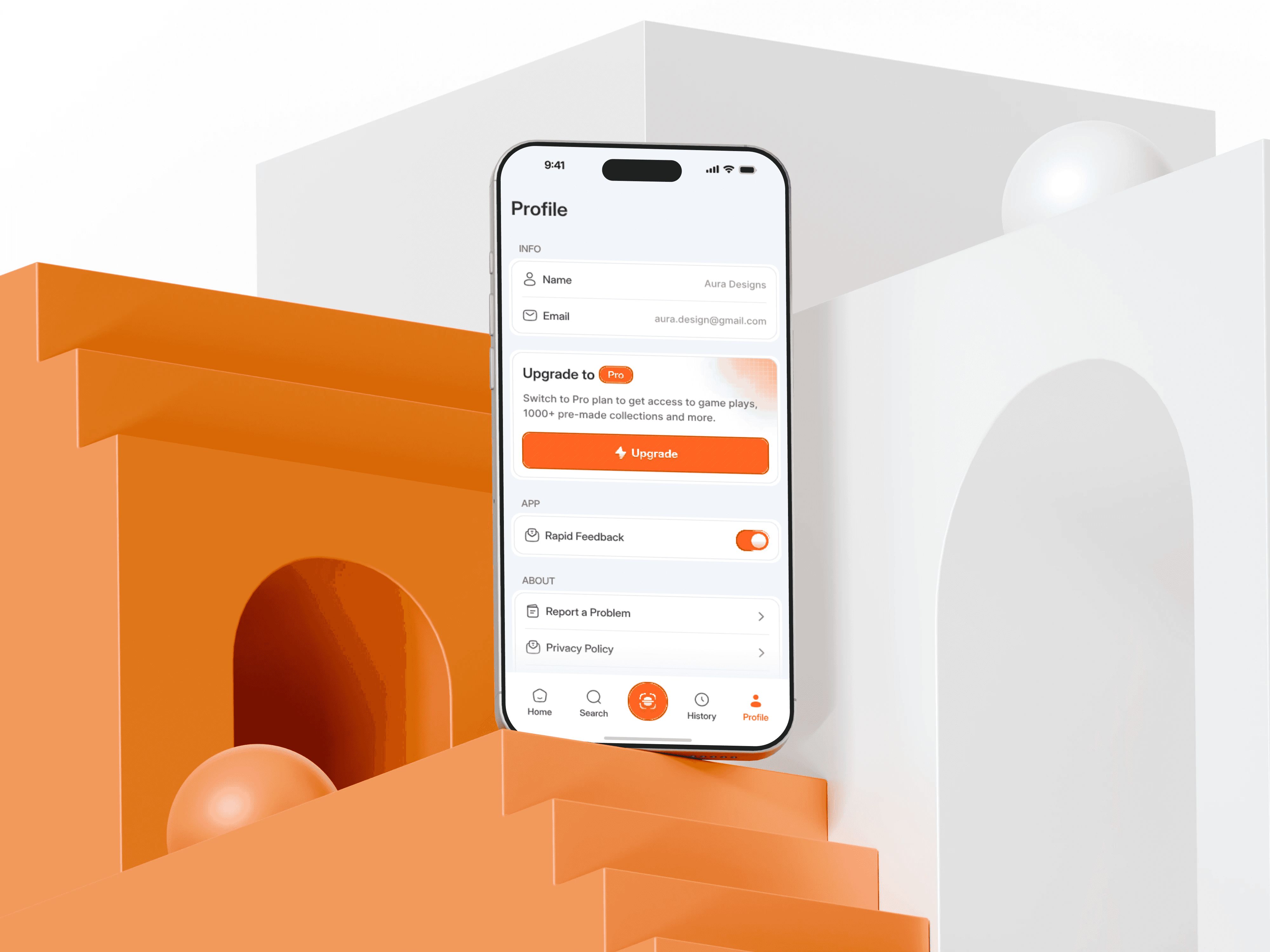
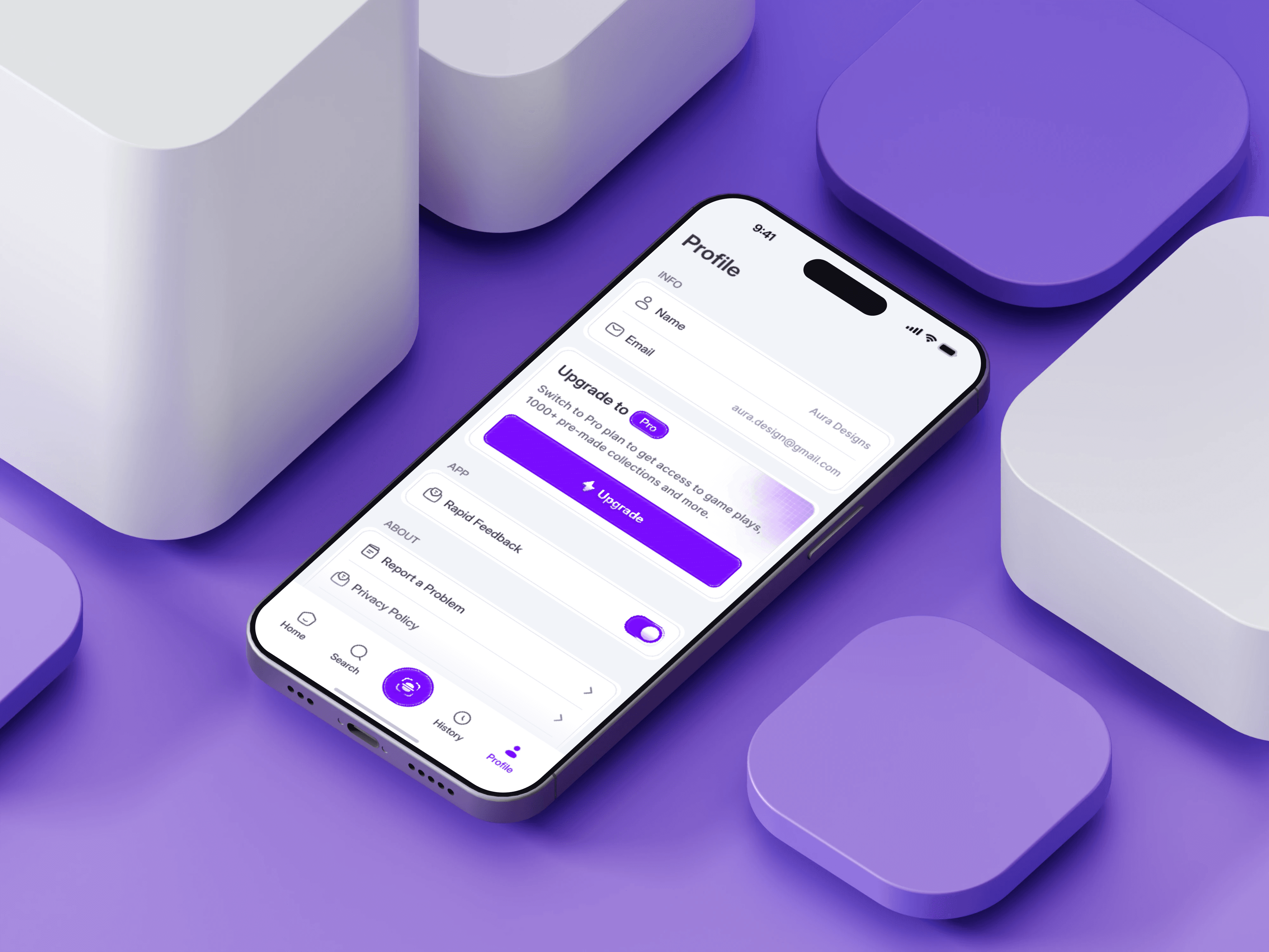
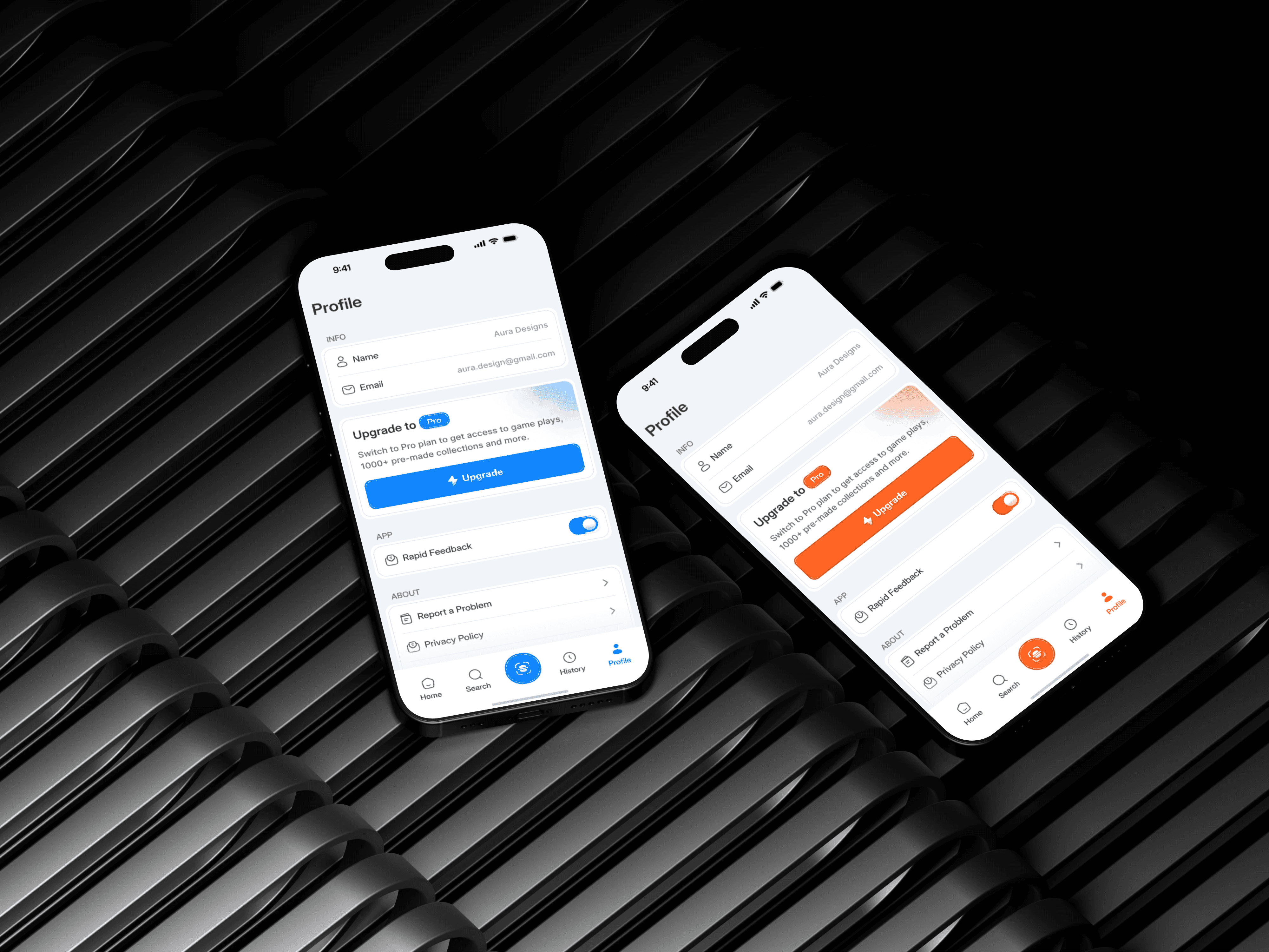
Our goal was to create a clean, user-friendly profile settings screen that simplified interactions and empowered users to manage their preferences effortlessly.Steps Taken
Key Improvements
Streamlined Navigation: Settings were grouped into logical categories (e.g., Account Info, Privacy, Notifications), making it easier to find features.
Personalization Options: Users could now upload profile pictures, adjust visibility, and customize themes.
Real-Time Feedback: Instant validation for actions like email and password updates.
Modern Design: Enhanced readability and usability with clear icons, headers, and optimized spacing.

Results and Impact
After the redesign, SwiftSync experienced a 40% increase in user engagement with the profile settings screen and a 25% improvement in profile completion rates. The intuitive navigation and personalized options became standout features, leading to higher user satisfaction and stronger retention across the platform.